


Bringing numbers to life

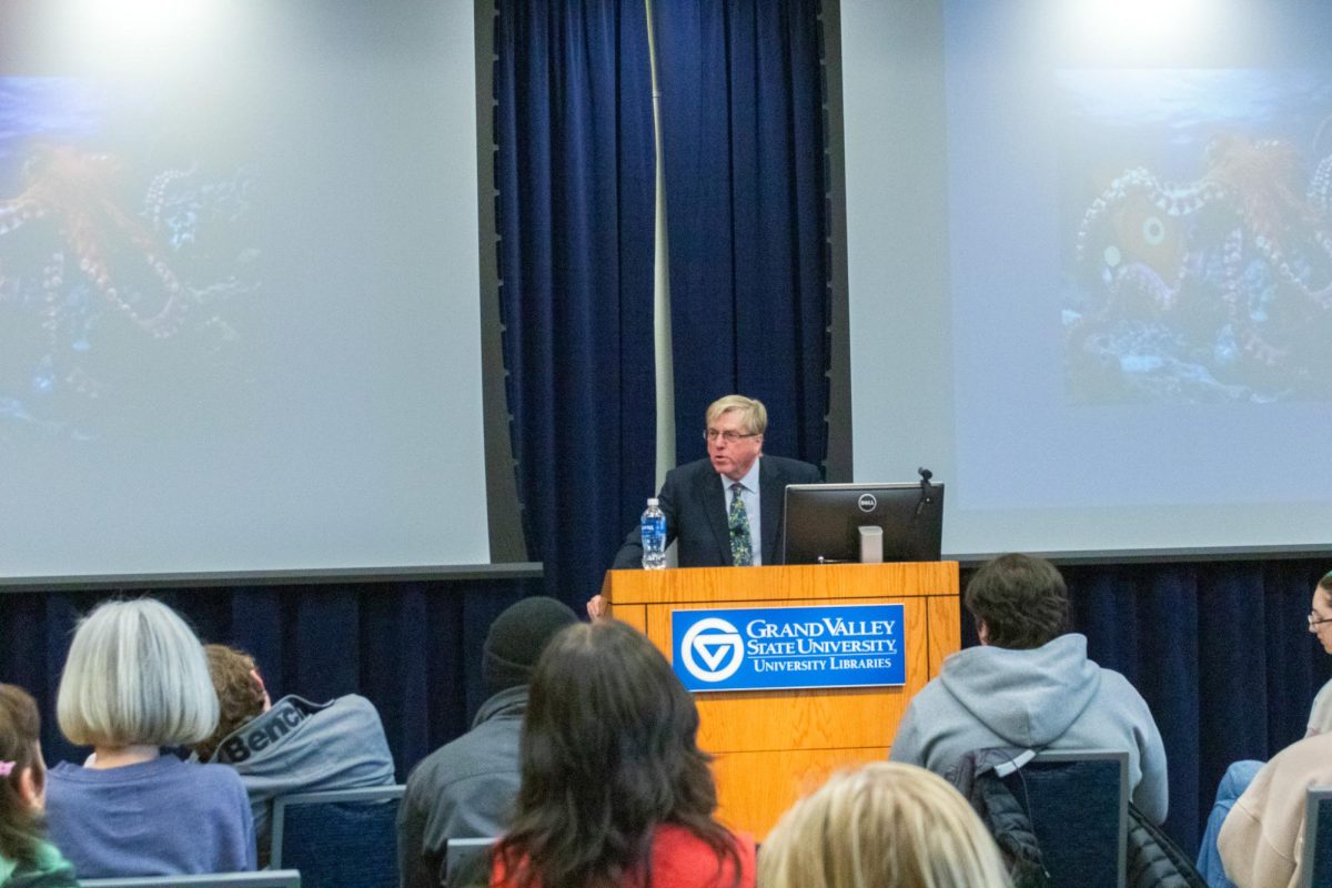
GVL / Kasey Garvelink – On Mar. 21, 2016 Amanda Cox presented some of her work to students and faculty in Allendale.
Mar 24, 2016
Data drives information and gives people a way to quantify different facets of daily life in ways that have never been thought of before. That data might get confusing at times, and having the ability to take that data and translate it into simpler terms and graphics can be labor-intensive.
Amanda Cox, the editor of The Upshot at the New York Times, has perfected the art of reporting through the use of informational data and beautiful, interactive graphics. Cox visited Grand Valley State University on March 21 to talk about how she works with statistics and data to bring a new light to everyday situations.
Cox, who studied statistics at St. Olaf College and later at the University of Washington, focused on the elements that she believes needs to be part of a graphic or chart for data visualization to really succeed.
Cox, a 2012 recipient of the Excellence in Statistical Reporting award, said that any type of data visualization has to show or reveal scale, context and patterns in order to be interesting and engaging.
Scale acts as a way to clean up numbers, taking very large numbers and adding some contrast to make them more realistic.
“One of the first things that we do with data visualization is to clean up that ‘a lot’ to ‘a little bit’,” Cox said. “You feel that contrast.”
The contrast of scale went hand in hand with her next point, context. Context gives readers a way to relate big and often dense information back to their own lives and put that information in a frame they understand.
Cox used the Olympics as an example of the importance of context. Many people watch the Olympics, but are unfamiliar with how big some of the tracks that athletes compete on, specifically, luge tracks, Cox said. Cox and her team set up a graphic where they laid out a luge track as if it were built in the middle of Times Square in New York City, just to give people an idea of how large it actually is.
This is the type of context that Cox said she aims to provide in all of her data visualization.
“How you connect new knowledge to old knowledge is what I think context is really all about,” Cox said.
Cox likened context to background singers — creating context by adding supplemental information isn’t to call attention to that information itself, but to help make a more cohesive final product, similar to how background singers make a lead singer sound good.
Finally, patterns, said Cox, can show you data that you wouldn’t have known to look for.
A common pattern-heavy type of data is exit polling on election nights. Even something as cut and dry and simple demographics can be made into something interesting and interactive.
Cox used the example of the 2008 presidential election, when Hillary Clinton and Barack Obama were the frontrunners of the Democratic party. By showing individual states as boxes, allowing people to click on different demographics, the boxes would move to one side of the graphic to show which candidate that demographic supported more.
“It allows you to ask questions and to see things that wouldn’t be otherwise seen,” Cox said. “If you didn’t know what you were looking for, you probably were not going to find this in a table.”
Cox talked about how she thinks that interactivity is so important when it comes to data visualization. On a ‘draw it yourself’-type graph showing class in America, she noticed that some respondents had taken it upon themselves to draw things like the Seattle skyline, among other things.
“The dumb things people are doing are really about true interactivity,” she said. “True interactivity has to enable you to do something totally stupid.”
Cox also stressed the importance of annotation layers that typically go along with graphics, which gives writers the chance to explain what everything is without taking away from the story. This, she said, is a good way to keep people engaged and to show them what is unique about the information being presented to them.
Cox’s presentation was hosted through the Big Data Initiative at GVSU, an initiative that began over three years ago to determine how GVSU will prepare students to engage with a surge of data production and dissemination.
“(Cox’s) presence here today furthers the mission of the BDI, as she is the embodiment of the engaged citizen of the digital world, teaching us about the complex issues of our age with statistical authority and critical analysis,” said Maria Cimitile, a philosophy professor involved with the BDI. “And, some pretty darn good graphics.”
Cox reminded event attendees that it’s not about just making cool graphics and charts if they aren’t answering questions that people want to know.
“As you embark on your own data visualization, I encourage you to think less about the technology and the tools and think about, ‘what are the questions that we are trying to answer?'” she said. “My claim is that you can have the best question in the world and draw it in chalk on the sidewalk and it will still be interesting.”